Schola Latína
Európæa & Úniversális
Latiné loqui disce sine molestiá!
Learn to speak Latin with ease! ¡Aprende a hablar latín sin esfuerzo!
Apprenez à parler latin sans peine! Impara a parlare latino senza sforzo! Lernen Sie latein zu sprechen ohne Mühe!
***
|
SCHOLA
InvítátióRatió studiórum Núntií DE LINGUÁ LATÍNÁ
LitteræSoní Déclínátió Conjugátió DÉ VOCÁBULÍS
Dé eís discendísDé neologismís Nómina locórum VINCULA ÚTILIA
Bibliotheca AugustanaGrex Latine Loquentium Societas Circulorum Latinorum Societas Familiarum Latinarum 

© 2005-2024 |

Letters
LITTERÆ
English | Español
you will need to have the following font installed on your system:
Zapfino.
Maybe this font can be downloaded for free from the Internet.
The alphabet used by the Romans of the classical period consisted of the following letters:
A B C D E F G H I K L M N O P Q R S T V X Y Z
It is basically the same alphabet as is still used today by a majority of languages in the world. The ancient Romans already observed a functional difference between the standard I and a more elongated alternative, which would later became J, but didn’t conceive of a meaningful distinction between V and U, as was later established, nor did they use other variants like Ç, Ñ or W.
The Romans of the classical period had several styles to write the above letters, greatly depending on the materials used to write. As is true for most scripts, nevertheless, these styles can be grouped into two distinct ones.
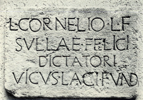
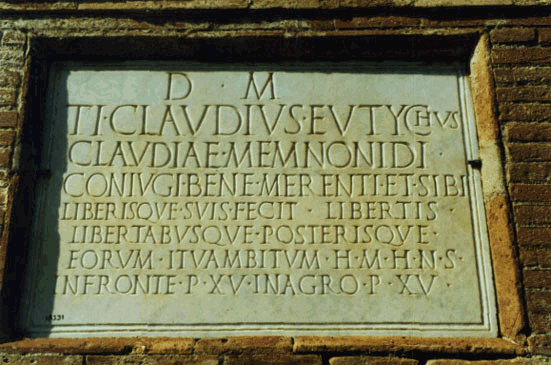
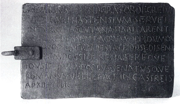
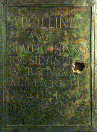
There is a formal one, that we now call capitális, that was used on monuments, legal documents, public announcements, books for sale, jewelery, and in general whenever the text was meant to endure and might even have some sort of ornamental value. We can see it below used on stone, bronze, plastered walls, papyrus or, later on, parchment, and on many other surfaces and objects.
|
|
|
l·cornelio·l·f / svllae·feljcj /
dictatori / vicvs·laci·fvnd |
|
|
d·m / ti·clavdivs·evtychvs / clavdiae·memnonidi· / conivgi·bene·merenti·et·sibi / liberisqve·svis·fecit·libertis / libertabvsqve·posterisqve· / eorvm·itvambitvm·h·m·h·n·s· / infronte·p·xv·inagro·p·xv· |
|
|
l·aimilivs·l·f·inpeirator·decreivit / vtei·qvei·hastensivm·servei / in·tvrri·lascvtana·habitarent / leiberei·essent·agrvm·oppidvmqv / qvod·ea·tempestate·posedisent / item·possidere·habereqve / iovsit·dvm·popvlvs·senatvsqve / romanvs·vellet·act·incastreis / ad·xii·k·febr |
|
|
apollini / avg / sempronivsca/rvs silvini f / lvcretivsmarti/alis lvcreti f / aediles / d s p f c |
|
|
|
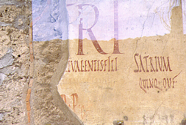
Election poster (from Pompeii and Herculaneum Syllabus, Classics 36 <http://www.amherst.edu/~classics/class36/pompeii/topography.html>) |
|
|
|
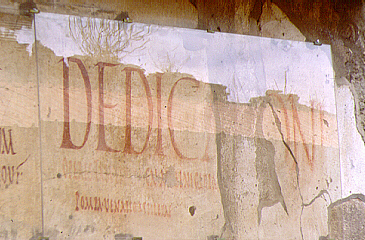
Announcement for a show (from Pompeii and Herculaneum Syllabus, Classics 36 <http://www.amherst.edu/~classics/class36/pompeii/topography.html>) |
|
|
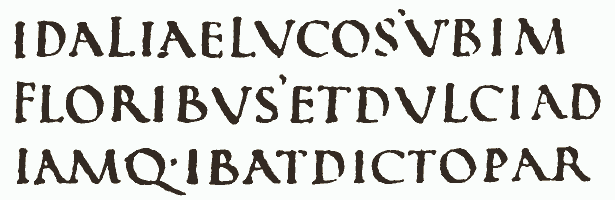
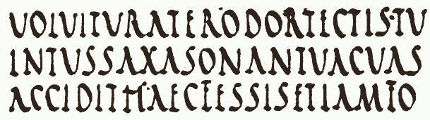
idaliaelvcos’vbim[ollis’amaracvs’illvm] / floribvs’etdvlciad[spirans’complectitvrvmbra] / iamq·ibatdictopar[ens’etdonacvpido] (Verg. A. 1,693ff.) |
|
|
volvitvraterodortectis·tv[mmvrmvrecaeco] / intvssaxasonantvacvas[·itfvmvs·ad avras·] / accidithaecfessiset[iamfortvnalatinis·] (Verg. A. 12,591ff.) |
|
|
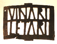
vinari / letari |
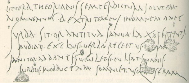
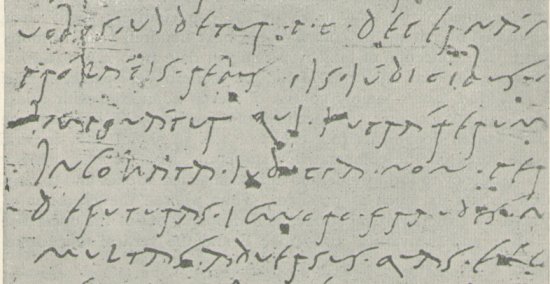
There was a second style, the informal one, that we now call cursíva, that was used for everyday transactions with no ornamental value. This is less well known to most people, because of the precarious nature of the materials on which it was used and the lesser artistic value of the objects where we find it; but it was in fact the main style most Romans would have used in their practical lives. We can see it below on waxen or wooden tablets, wall graffiti or bone, and was used on many similar surfaces.
|
|
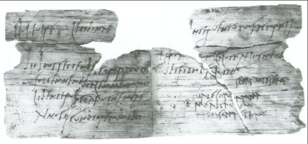
cn pompeio grospho grospho / pompeio gaviano II vir jvr dic / vi idvs jvlias / privatvs colonorvm coloniae / veneriae corneliae pompej/anorvm ser scripsi me / accepisse ab l caecilio jvcvndo / sestertios mille sescentos |
|
|
cl · seuerá · lepidinae [suae] / [salu]tem / jiijdusseptemb[res]sororaddie[m] / sollemnemn[a]talemmeumrogo / libenter[f]aciásutuenias / adnosi[u]cundioremmihi [diem]jnteruentútuofacturásj / [...] / cerial[emtu]umsalutáaeliusmeus / <ó?> etfiliol[u]ssalutant / sperabotesoror / ualesoro[r]anima / meaitau[al]eam / karissimaethaue |
|
|
6. littera theorianis semperdictvra salvtem / nominenvnc · dextri tempvs inomnemanet (Anon.) 7. svrda · sit · orantitva janva · laxaferentj / avdiat · exclvsi · verba · receptvs · [a]man[s] (Ov. Am. 1,8,77) janitor · addantjs · vigilet · si · pvlsat · jnanis / svrdvs · in · obdvctam · somniet · vsq[ve ·] seram (Prop. 4[5],5,47) |
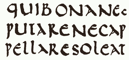
In time there developed a third style, the unciális, which is just a smaller version of the capitális with some strong influence of the cursíva.
|
|
quibonanec/putarenecap/pellaresoleat (Cic. Rep. 1,27) |
|
|
suamanubonu[mnobilemocciderat] / alanatonecen[soresenatumotusest] / uastaitaporcia[facta] / mclaudiomarcello[qfabiolabeonecos] / plicinicrassipo[ntificismaximi] / ludisfuneribus[...] |
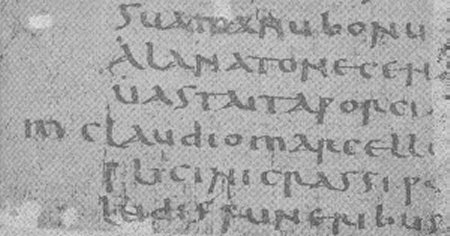
The shapes of the letters of the capitális style are practically identical with our present capitals, whereas the cursíva may have influenced the evolution of the former into the unciális, a smaller version which is in turn the predecessor of our lower case characters; but it is important to understand that, in Roman times, the difference between the capitális and the cursíva, or even the later unciális, was not at all comparable to the difference we now make between capitals and lower case when we use capitals at the beginning of some words, or for titles, in texts otherwise written in lower case.
ABCDEFGHIJKLMNOPQRSTUVWXYZ
abcdefghijklmnopqrstuvwxyz
They were just different styles to write the same single case of letters, and were equivalent rather to the duality that exists between our printing and our handwritten letters. They would of course not have been mixed in any one piece of writing, as we would not type some letters and write others by hand within the same text, let alone the same word.
ABCDEFGHIKLMNOPQRSTVXYZ
ABCDEFGHJKLMNOPQRSTUXYZ
Just like the Arabs or the Japanese, therefore, in spite of a variety of writing styles, the Romans didn’t either have an equivalent to our meaningful alternation between capitals and lower case within the same piece of writing in any of them, nor did they write any differently the first letter of a sentence or proper name and the rest.
Ligatures
The Romans, in order to save space, given the high cost of most of the materials they wrote on, used the so called ligátúræ, i.e. groupings of letters written as a cluster by sharing a common stroke. There were many of them: AE could be found as Æ, and similarly AN, TR, VM and many others could appear fused together in groups of two, three and even more letters.
|
|
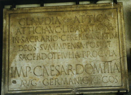
clavdia · attica / attici · avc · lib · a · rationib / in · sacrario · cereris · antiatinae / deos · sva · impensa · posvit / sacerdote · ivlia · procvla / imp · caesar · domitiano / avg · germanic · XI · cos |
|
|
l·cornelio·l·f / svllae·feljcj / dictatori / vicvs·laci·fvnd |
Diacritics
The Romans had only two diacritics, and they didn’t use any of the two with any regularity.
Dot
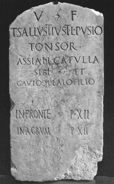
The Romans would often write without even separating the words with spaces, as we have seen above in several instances. Moreover, they certainly never distinguished sentences or phrases using commas, semicolons, colons or stops, neither did they know of question or exclamation marks, brackets, inverted commas or any other diacritic we are used to. In fact, the only sign they used, and only in the more elegant writings, like monumental ones, was a dot they used not as final stop, but to separate single words. We have also seen this on the inscriptions above. This dot could sometimes take more sophisticated shapes, as a little ivy leaf, for instance, as below.
|
|
v·f / t·sallvstivs·t·l·pvsio / tonsor / assia·l·l·catvlla / sibi·et / gavio·c·l·lalo·filio / in·fronte·p·xii / in·agrvm·p·xii |
Apex
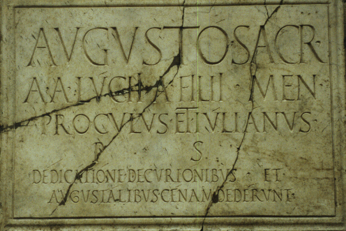
The Romans of the most sophisticated period of classical culture used, as much in monumental writing as in more domestic texts, a sign called apex, identical to what we nowadays know as acute accent ( ´ ). This sign, nevertheless, was not used to indicate the accent or stress in the word as in a minute number of modern vernaculars, but to mark long vowels (see the file on pronunciation), as is still done today in languages like Icelandic, Hungarian, Czech and many others.
|
|
augustó · sacr · / a · a · lúcij · a · filij · men · / proculus · et · iúliánus · / p · s · / dédicátióne · decuriónibus · et · / augustálibus · cénam · dedérunt |
|
|
uobis · ujdetur · p · c · decernám[us · ut · etiam] / prólátis · rebus ijs · júdicibus · n[ecessitas · judicandi] / jmponátur quj · jntrá rerum [· agendárum · dies] / jncoháta · judicia · non · per[egerint · nec] / defuturas · ignoro · fraudes · m[onstrósa · agentibus] / multas · aduersus · quas · exc[ogitáuimus] / ... |
Latin spelling nowadays
It is obvious that the writing practices of the Romans of the classical period were rather primitive in comparison with present ones. Some people believe for that reason that our spelling habits are vernacular, and therefore somehow spurious and artificially imposed on Latin subsequently. They forget that most of our spelling customs are the natural development of Roman practices and were organically furthered throughout history by people who spoke and wrote in Latin, in order to achieve greater clarity and distinction when reading and writing Latin itself, not the vernacular languages; and these usages passed on from Latin to the vernaculars, and not the other way around.
The ancient difference in shape between a shorter and a more elongated I (i/j), the latter of which, already in antiquity, was frequently used in the cursiva in word-initial position, often corresponding to the consonantal sound, as can be seen in the illustrations above, was formalised in later periods for this useful function specifically, thus allowing for complete transparency as regards the difference in pronunciation between the first sound in janua and in iambus, or in meaning between forms like perjerat and perierat. The previously meaningless difference between the pointed V of the capitalis and the rounded u of some forms of cursiva or of the uncialis was equally put to the service of a more transparent spelling. It was thus finally possible duly to distinguish vowels from consonants. Other variants that could be allocated no distinctive phonetic value, like a taller or shorter T or a more or less stretched S, were either kept for merely aesthetic purposes or eventually dropped as functionally improductive. Some ligatures like æ or œ were likewise preserved to help distinguish the corresponding diphthongs from the hiatuses ae and oe, whereas many others were abandoned. The separation of words by means of spaces was found to be such a useful device that few contemporaries would be able to read without it; and the rich variety of signs of punctuation introduced also in later stages of the history of Latin helped reading with the necessary pauses, and allowed us to distinguish the component parts of sentences, or to determine beyond doubt whether we are confronted with a statement, an exclamation or a question. Finally, the distinction between capitals and lower case brought in not only a certain elegance, but also some further clarity to grammar (highlighting proper names) and to discourse structure (marking the beginnings of sentences).
There has most unfortunately arisen, nevertheless, and for all the wrong reasons, a fashion of spelling fundamentalism that, abandoning a more than reasonable tradition of centuries of Latin writing, purports to go back to the writing usages of the ancient Romans. This is as absurd as wanting to give up the use of paper or the modern book, and claiming that something is not classical Latin unless it’s written on papyrus rolls. It should be obvious to anyone that we can be completely respectful of ancient culture and cultivate the purest form of classical Latinity while using more developed methods of writing than our ancestors had at their disposal and which are moreover the result of centuries of Latin tradition. Of course, since fundamentalists rarely guide themselves by reason, the return to the old usages doesn’t follow any further criteria than their own arbitrary whim, and they sometimes are purists and sometimes not, as they please. Thus, some have set about eliminating the distinction between i and j as non-Roman, but they are only too happy against all logic to keep that between v and u. Others consider that the use of capitals should be eliminated, and they do use lower case letters at the beginning of sentences, but they then arbitrarily keep capitals for proper names or even adjectives. Of course, none of those purists has dared to admit the fact that a return to ancient usage would imply writing everything rather in capitals than in lower case, and that they would in fact have to stop using any punctuation at all.
The saddest aspect of the modern spelling mess is that it has nothing to do with Latin. It originates in attempts at spelling reforms that seemed to make perfect sense in a vernacular like Italian, but which some people felt the need to force also upon Latin, with deplorable consequences. While most European languages, including Latin, felt very comfortable with the century-old usage of i and j, and v and u, as all those letters represented clearly different sounds or appeared in clearly different syllabic contexts, in Italian the use of i and j had become so complicated by conflicting and arbitrary uses without too much relation with any phonetic reality that people struggled to determine when a word had to be written with i and when with j. Italian being a language with otherwise very straightforward spelling principles, a pressure arose therefore to drop the use of j. Now, this absolutely sensible measure for Italian was unnecessarily applied also to Latin by people who were persuaded that Latin must be spelt as modern Italian. Obviously, they could never have convinced the international Latin using community on such grounds, so they started to contrive specious justifications: that the sound of the vowel and the semivowel were similar enough (even though it is exactly the same difference that i and j have in German and many other languages that have never considered dropping the spelling distinction), that it brought Latin spelling closer to ancient practices (although, as we have explained, the distinction between i and j has in fact a much more ancient history than that of u and v), etc. Of course, they never mentioned that every single one of those reasons applies with exactly equal force to the Latin pair i/j (where [i] differs from [j]) and to the pair u/v (where [u] differs from either [w] or [v], however we care to pronounce it), which the Italians had no intention to simplify because in Italian it made sense to continue to use both letters in the latter case. As the international community began to drop the use of j in a quest for ancient purity, it became more and more obvious to everyone who hadn’t given up the human capacity to reason, that it made absolutely no sense in Latin to drop the j without dropping also the v; so, having genuinely assimilated the specious excuses of the Italians to bring Latin spelling closer to Roman times, the best philologists around the world felt it absolutely necessary to do without v too, and many critical editions of classical texts are now published that way. We have thus a traditional i/j/u/v system, which was foolishly undermined and turned into just i/u/v in accordance with some vernacular spelling reforms, but in a move that has now inevitably but most unfortunately backfired (certainly against the expectations of those who promoted the use of i/u/v) into an ugly i/u system as the only reasonably acceptable outcome. Not only that, following the same perverse train of thought, many now feel the need also to drop the use of capitals in Latin texts. Where this absurd nonsense will take Latin spelling is difficult to foresee, but we cannot but lament that the narrow-minded whim of a nation with the most arrogant attitude towards the language of our common civilisation has managed to bring absolute chaos to an elegant, sensible, and century-long Latin spelling tradition.
We consider that our spelling usages were developed through millennia according to criteria of utility and clarity, which it is as absurd as it is unnecessary to renounce. Even if some certainly rude spirits could consider giving up aesthetic developments like the distinction between capitals and lower case, it seems absolutely preposterous to eliminate usages that reflect better the pronunciation of the language and help reading.
Indeed, we should avoid as non-transparent spelling those practices which, with the specious excuse of being truer to ancient practices or following vernacular considerations, disregard centuries of legitimate Latin spelling tradition and prefer to hinder learning of the Latin language by failing to represent transparently its different sounds. Using one and the same letter i to represent both the vowel [i] and the consonant [j] may be true to the most ancient practices, but it is as unfortunately as unnecessarily non-transparent because it doesn't allow to distinguish which is which in words like "iam" (where the i represents a semivowel, pronounced as English y in yes) and "iambus" (where the i represents a vowel, pronounced as English i in it), etc. Non-transparent spelling makes that more and more people nowadays fail to learn the language properly as they are preposterously kept in the dark about the sounds the words they read and write actually contain (we've heard many a professor, let alone students, pronounce "iam" rhyming with Ian and "iambus" starting as yummy). Using i for the vowel and j for the semivowel is conversely a much more transparent spelling, which is justified by centuries of Latin spelling tradition and which allows us to see immediately which is which by writing "jam" but "iambus", etc. Equally using the same ae combination both for the diphthong in "aereus" (where the ae represent a diphthong, pronounced in one syllable, rather like English eye) and the hiatus in "aerius" (where the ae represent an hiatus, pronounced in two syllables, rather like English a in father followed by the e in error), etc. is sadly non-transparent (and leads to error just as many). Using æ for the diphthong and ae of the hiatus, or at least ae for the diphthong but aë for the hiatus, is a much more transparent spelling and it allows us to see immediately which is which by writing "æreus" but "aerius" (or "aereus" but "aërius"), etc.
As inconsistent spelling we must avoid spelling practices that choose to be transparent in some cases but not in others with no legitimate phonetic or historical reason to do so in one case and not in the other whatsoever, as when some people choose to distinguish the vowel [u] from the semivowel [w] by writing the former as u and the latter as v, which is a nicely transparent practice, rather than spelling both as u, which would be non-transparent, and they don't care in this case not to be true to ancient practices; but then, with no phonetic or historical reason to do so, they choose not to to distinguish the vowel [i] from the semivowel [j] by writing the former as i and the latter as j, which would be nicely transparent practice, rather than spelling both as i, which is non-transparent. Equally choosing to distinguish the diphthong æ from the hiatus ae in a usefully transparent way, rather than writing both as ae, but at the same time not distinguishing the diphthong from the hiatus oe and writing both non-transparently as oe, would be also inconsistent.
Finally, indicating the length of the vowels in writing was something that the ancient Romans didn't need to do because they just knew which was which, either because they were native speakers or because they could learn to pronounce the words by listening to native speakers. The use of the apex in ancient inscriptions or manuscripts is therefore quite haphazard. For us, on the other hand, using a more thorough form of spelling, consistently marking all long vowels, is much more poignantly required if we aspire ever to learn to pronounce the words correctly. There was one case, nevertheless, when even ancient native speakers advocated that the use of the apex is actually necessary (cf. Quint. Inst. 1,7,2s), and that is when when a difference of length in a vowel can produce a different meaning in a word, as in "malus" and "málus" or "liber" and "líber" or "rosa" and "rosá" or "loqueris" and "loquéris". We must certainly never omit such necessary apices.
It is absolutely unnecesary to give up our spelling lore, on any grounds; and we advocate the full reinstatement of our century-long, sensible spelling tradition, in the interests of transparency, consistency, and thoroughness.